Steinberg’s latest update to Cubase promises major improvements, but does it live up to the hype? How well do all those new features apply to dance music production? We put it to the test.
Well, it’s been nearly two years in the making – and with little information as to what features and improvements it might contain – but Cubase 7 has now officially landed.
In fact, since its announcement a few weeks ago, the official Cubase forum has been buzzing with excitement, speculation, criticism and recrimination – all before any of its contributors had even got hold of the software in question, such is the fully wired world in which we live. Luckily a mood of (near) sanity has arrived since the actual release on 5th December.
Despite a few unexpected surprises, what’s on offer sticks closely to the earlier press releases. Top of the bill is the new MixConsole that replaces the mixer windows in Cubase 6. Although in certain respects MixConsole doesn’t profoundly change the basic mixer building blocks (or internal signal flow), it does introduce some interesting new features and enhancements, and is visually quite different to previous versions.
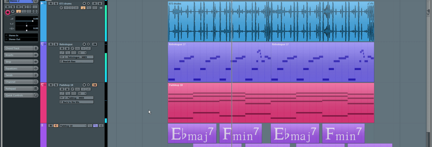
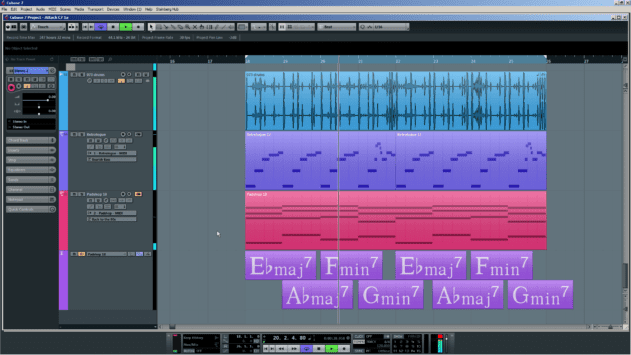
On the composition side of things, the new Chord Track and Chord Assistant features link into both MIDI and audio tracks (via the updated VariAudio engine) to help your track writing.
For those new to Cubase, or not too keen on navigating the 900-page PDF manual, Cubase 7 also introduces an array of instructional videos accessible via the new Steinberg Hub shown on startup.
MixConsole
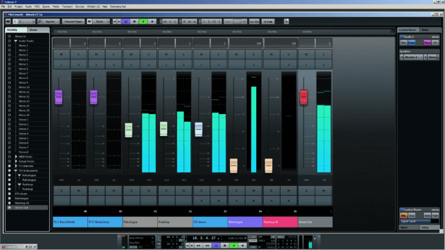
Like the rest of Cubase 7, an overall darker hue is apparent in the MixConsole. It certainly has a very different look and feel to the previous mixer. The window itself is fully scalable and is capable of being displayed in full screen mode. The aim here appears to be to place more emphasis on a single-window concept that ultimately moves focus away from a single main arrangement window and attempts to minimise the overuse of menus – though one could argue that this has now been replaced with icon-based menus instead.
The scalability itself is generally welcome, and allows you to focus on specific areas of the mixer more easily, though it does take some getting used to in comparison to the fixed layout of Cubase 6. Some text visibility has also suffered in this customisation bonanza, but hopefully this can be addressed in a further update.

The new MixConsole marks a dramatic improvement to the previous mixer
The MixConsole window is split into a number of functional areas. The top of the window features icons for universal functions and controls. The Rack in the centre, which alludes to the outboard rack in a traditional studio, can be configured in a number of ways for viewing effect sends, insert effects and the new Channel Strip (a pre-configured set of processing blocks available on every track).
Along the left of the window a track list allows channel visibility and location (Zone) options to be adjusted, whilst on the right you find the Control Room (still also available as a separate window) for configuring mix and monitor outputs, and a new and comprehensive metering section.


